Donnerstag, 13. Juni 2013

Plot intersecting areas

Ever had to plot intersecting areas?
From now on I would use rgeos to do similar things. The following does the trick:

library(rgeos)
library(DescTools)


Canvas(, xpd=TRUE)
p1 <- as(DrawCircle(0.5)[[1]], "gpc.poly")
p2 <- as(DrawCircle(-0.5,0.5)[[1]], "gpc.poly")
p3 <- as(DrawCircle(0,-0.5)[[1]], "gpc.poly")

plot(append.poly(append.poly(p1, p2), p3), axes=FALSE, frame.plot=FALSE, xlab="", ylab="")
plot(intersect(p1, p2), poly.args = list(col = "red"), add = TRUE)
plot(intersect(intersect(p1, p2), p3), poly.args = list(col = "blue"), add = TRUE)


Samstag, 20. April 2013

Second axis

Just a short snippet for a plot with 2 axes for demonstrating the technique.


b <- barplot(1:10, ylim=c(0,20))

par(new=TRUE)
plot(x=b, y=rep(60, 10), xlim=par("usr")[1:2], xaxs="i", yaxs="i"
     , frame.plot=FALSE, axes=FALSE, xlab="", ylab="", type="b", pch=15
     , ylim=c(0,80))

axis(side=4)


And the result:


Dienstag, 4. Dezember 2012

Barplot in Tibco Style

Tibco has a nice software which produces good looking plots:

tibco.colors <- apply( mcol <- matrix(c(
  0,91,0, 0,157,69, 253,1,97, 60,120,177,
  156,205,36, 244,198,7, 254,130,1,
  96,138,138, 178,113,60
), ncol=3, byrow=TRUE), 1, function(x) rgb(x[1], x[2], x[3], max=255))

x <- c(12,8,6,4,3,1,1)

par(mgp=c(2.2,0.7,0) )     # decrease distance label to axis

b <- barplot( x, col=rev(tibco.colors), main="Tibco style", border=NA, cex.axis=0.7, las=1, ylim=c(0,13), yaxt="n")

text( b, x+0.6, label=x, cex=0.7)

axis(side=1, at=b, labels=c("EX","VIT","EC","CE","LA","CO","PA"), cex.axis=0.7, las=2, col="grey", las=1, tck=0, xaxs="i")
abline(h=0, col="grey")    # just to ensure the axis going through (0,0)

# find the centers of the bars and the gaps
run.mean <- filter( b, filter=c(0.5,0.5))[-length(b)]
gapx <- c(run.mean[1]-diff(b)[1], run.mean, run.mean+diff(b) )
rug(gapx, -0.025, col="grey") 

axis(side=2, at=0:12, labels=0:12, cex.axis=0.7, las=2, col="grey", las=1, tck=-0.025)

legend(x="topright", legend=c("Marking","","CONMEDS","DEMOGRAPHICS","ECG","EXPOSURE","LAB_RESULT")
  , fill=c(tibco.colors[1],NA,tibco.colors[2:10]), cex=0.7, box.col=NA, border=c("black",NA,rep("black",10)))


Samstag, 17. November 2012

dots arguments

How can we parse the dots-arguments in a function?

dots <- function(...){
# was cex in the dots-args? parse dots.arguments
cex <- unlist(match.call(expand.dots=FALSE)$...["cex"])
if(is.null(cex)) print("No cex supplied")
else print(gettextf("cex was %s", cex))
}

dots (cex=0.9, another=4)
dots (another=5)

Donnerstag, 4. Oktober 2012

Get all loaded data.frames

Which data.frames have we loaded?
ls()[ lapply( lapply(ls(), function(x) gettextf("class(%s)", x)), function(x) eval(parse(text=x))) == "data.frame" ]

All available functions in a package:
ls.str(pos = 1, mode = "function")

All installed packages:
search()
(.packages())
(installed.packages())


All available function on search() path:
strsplit( lsf.str(pos = length(search())), " :")

Dienstag, 18. September 2012

Conditional Mosaics: Cotabplot

Fine implementation, thanks to Achim Zeileis.

library(vcd)
data("Punishment", package = "vcd")
pun <- xtabs(Freq ~ memory + attitude + age + education, data = Punishment)
cotabplot(~ memory + attitude | age + education, data = pun, panel = cotab_coindep,
  n = 5000, type = "mosaic", test = "maxchisq", interpolate = 1:2 )

Donnerstag, 13. September 2012

Conversions

How can we split a matrix columnwise to a list?
m <- matrix(rnorm(10 * 2), ncol = 2)

The first solution uses a double conversion via a data.frame:
as.list(as.data.frame(m))

The second uses split:
split(x=t(m), f=1:ncol(m))

The third solution works with lapply:
lapply( seq_len(ncol(m)), function(k) m[,k])

Dienstag, 4. September 2012

Flexible arguments for R functions

How can we remain flexible concerning arguments of an R function used within a user function. Say we want a histogram to be included in our plot and be able to define all of it's arguments.
I found a good solution in some R-Core-code (don't remember exactly where...).
It goes like that:

myFunction <- function( x, main = "", args.hist = NULL, ... ) {

  # define default arguments
  args.hist1 <- list(x = x, xlab = "", ylab = "", freq = FALSE,
      xaxt = "n", xlim = NULL, ylim = NULL, main = main, las = 1,
      col =  "white", cex.axis = 1.2)
  # override default arguments with user defined ones
  if (!is.null(args.hist)) {
    args.hist1[names(args.hist)] <- args.hist
  }
  # call function by means of do.call with the list of arguments
  # we can even filter the arguments by name here...
  res <- do.call("hist", c(args.hist1[names(args.hist1) %in%
      c("x", "breaks", "include.lowest", "right", "nclass")],
      plot = FALSE))
}

The function call would then be:
  myFunction( x=1:10, args.hist = list(right = TRUE) )

So we have a fine control over which arguments we want to be passed (include.lowest, right) and which ones not (ex. col, cex.axis).

Mittwoch, 16. Mai 2012

Find all subsets

How can we get all subsets of a vector's elements?

all.subsets <- function(x, min.n=1, max.n=length(x)){
  # return a list with all subsets of x
  # Caution: This can be heavy for moderate lengths of x11
  lst <- lapply( min.n:max.n, function(i) {
    m <- combn(x,i) # this is a matrix, split into it's columns
    lapply( seq_len(ncol(m)), function(k) m[,k])
  } )
  # Alternative:
  # lst <- lapply(min.n:max.n, function(i) lapply(apply(combn(x,i),2,list),unlist))

  # and now flatten the list of lists into one list
  lst <- split(unlist(lst), rep(1:length(idx <- rapply(lst, length)), idx))
  return(lst)
}

# example:
y <- letters[1:5]
all.subsets(y)

Dienstag, 8. Mai 2012

Run all examples of a package

Get all the base and recommended packages:
installed.packages(priority = c("base","recommended"))

A list of the functions in a package can easily be created by:
ls(pos = "package:MASS")

Run the examples for the first 10 functions of the package MASS:
for( x in paste("example(`", ls(pos="package:MASS")[1:10],"`)", sep="")){
  eval(parse(text=x))
}

Freitag, 23. März 2012

Running mean, median and others

The running mean (moving average) can be calculated in R by means of the function
x <- c(1,2,4,2,3,4,2,3)
filter(x, rep(1/3,3) )

and the running median by
runmed(x,3)

sequential differences by
diff(x)

for other statistics use the library zoo (and there maybe rollapply).
The time series functions can also be useful for similar problems (e.g. deltat, cycle).

package {caTools} has implemented some fast algorithms for similar purposes:
runmean(x), rumin(x), runmax(x), runquantile(x), runmad(x), runsd(x)

Donnerstag, 15. März 2012

regexpr examples (just to remember)

Find names ending in "_id" or in "_c" (this would be the same as x like any ('%_id', '%_c') in SQL flavour):

x <- c("vp_id","man_id","min_A_d","min_B_d","count_n",
       "type_c","birth_d","gender_c","age_n","hist_y")

x[grep("_(id)|c$", x)]
[1] "vp_id" "man_id" "type_c" "gender_c"


Get rid of everything but the digits:
x <- c("485.2.362.q", "222-445", "889 99 8")
gsub(pattern="[[:punct:]]|[[:alpha:]]|[[:blank:]]", replacement="", x)


gsub(pattern="[^0-9]", x=x, replacement="")
gsub(pattern="[^[:digit:]]", x=x, replacement="")


Extract uppercase words from the beginning of a string following the idea "delete everything which is not uppercase words":

x <- c("RONALD AYLMER Fisher", "CHARLES Pearson", "John Tukey")
sapply(x, function(x) StrTrim(sub(
       pattern=sub(pattern="^[A-ZÄÜÖ -]+\\b\\W+\\b", repl="", x=x)
       , repl="", x, fixed=TRUE)))


... and the fine link:
http://www.powerbasic.com/support/help/pbcc/regexpr_statement.htm

Donnerstag, 19. Januar 2012

Swap variables

... just because of it's elegance:
x <- 2; y <- 5
c(x, y)

y <- (x + y) - (x <- y)
c(x, y)

Dienstag, 22. November 2011

Recode a factor

Recoding a factor seems not to be a frequent activity of Ripley & Co. as it is astonishingly laboriously (because of the "else" part of it...).
The shortest trick I found so far is:

x <- factor(sample(letters, 20))
y <- x

levels(y) <- list(
  "good"=c("a","b","c"),
  "bad"=c("d","e","f"),
  "ugly"=c("h","m"),
  "else"=setdiff( levels(y), c("a","b","c","d","e","f","h","m") )
)
data.frame(x,y)

Anyone out there a better idea?

Mittwoch, 19. Oktober 2011

Evaluation of text

Just to remember (once for all):
eval( parse( text="a <- c(1,2,3)" ) )

Montag, 19. September 2011

Mengen-Vergleiche

Interessanten Mengenvergleichs-Funktionen:

(A <- c(sort(sample(1:20, 9)),NA))

[1] 1 2 3 12 16 17 18 19 20 NA
(B <- c(sort(sample(3:23, 7)),NA))
[1] 8 10 15 16 18 21 22 NA


# alle Elemente aus A und B (KEINE Duplikate)
union(A, B)
[1] 1 2 3 12 16 17 18 19 20 NA 8 10 15 21 22

# alle Elemente die in A und in B vorkommen (Schnittmenge)
intersect(A, B)
[1] 16 18 NA

# Elemente in A, aber nicht in B vorkommen
setdiff(A, B)
[1] 1 2 3 12 17 19 20

# Elemente in B, aber nicht in A vorkommen
setdiff(B, A)
[1] 8 10 15 21 22


# Enthält A die gleichen Elemente wie B?
setequal(A, B)
[1] FALSE

Donnerstag, 15. September 2011

Function call with a list of arguments

Use do.call to call a function with a previously built list of arguments:

# Define the arguments

args.legend <- list(
  x = "topleft"
  , legend = c(1,2)
  , fill = c("red","blue")
  , xjust = 1, yjust = 1)

plot(1:10, 1:10)
# call function with the arguments' list
do.call("legend", args.legend)

Get information about invisible built-in functions

How can we see the code of invisible functions, i.e. mosaicplot? 

> mosaicplot

yields only:

function (x, ...)
UseMethod("mosaicplot")


but the functions "methods" and "getAnywhere" do the trick:

> methods(mosaicplot)

[1] mosaicplot.default* mosaicplot.formula*

Non-visible functions are asterisked

> getAnywhere("mosaicplot.formula")
A single object matching ‘mosaicplot.formula’ was found
It was found in the following places
registered S3 method for mosaicplot from namespace graphics
namespace:graphics
with value

function (formula, data = NULL, ..., main = deparse(substitute(data)),
subset, na.action = stats::na.omit)
{
main
m <- match.call(expand.dots = FALSE)
.....

Donnerstag, 8. September 2011

Layout-Muster

Split screens:

m <- matrix(0:3, 2, 2)
layout(m, c(1, 3), c(1, 3))
layout.show(3)


m <- matrix(1:4, 2, 2)
layout(m, widths=c(1, 3), heights=c(3, 1))
layout.show(4)

Date formats and functions

Date formats:


Remember the functions:

d <- as.Date(c("1937-01-10","1916-03-02","1913-09-19","1927-12-23","1947-07-28"))

quarters(d)
[1] "Q1" "Q1" "Q3" "Q4" "Q3"


# ... or as function
quarter <- function (x) {
  # Berechnet das Quartal eines Datums
  y <- as.numeric( format( x, "%Y") )
  paste(y, "Q", (as.POSIXlt(x)$mon)%/%3 + 1, sep = "")
}

# ... or alternatively with cut
cut(d, breaks="quarters")
[1] 1937-01-01 1916-01-01 1913-07-01 1927-10-01 1947-07-01
137 Levels: 1913-07-01 1913-10-01 1914-01-01 1914-04-01 ... 1947-07-01


months(d)
[1] "Januar" "März" "September" "Dezember" "Juli"

format(d,"%B") # months alternative
[1] "Januar" "März" "September" "Dezember" "Juli"

format(d,"%Y") # years
[1] "1937" "1916" "1913" "1927" "1947"

Montag, 4. Juli 2011

Legend variations


par(mar=c(5.1,4.1,4.1,11.1))
plot( x=1:5, y=1:5, type="n", xlab="x", ylab="y" )

legend( x=2, y=6, legend=c("A","B","C")
  , fill=c("red","blue","green")
  , density=30, bty="n", horiz=TRUE
  , xpd=TRUE )

legend( x=2, y=2, xjust=0.5, yjust=0
  , title=" My title:", title.col="grey40", title.adj=0
  , legend=c("A","B","C","D","E")
  , pch=c(22,22,22,45,45), pt.cex=c(1.2,1.2,1.2,2,2)
  , col=c(rep("black",3),"orange","red")
  , pt.bg=c("blue","green","yellow")
  , bg="grey95", cex=0.8
  , box.col="darkgrey", box.lwd=3, box.lty="dotted" )

legend("topright", inset=0.05, cex=0.8, bg="white"
  , legend=c("A-1","A-2","B-1", "B-2")
  , col=c("lightblue","blue","salmon","red"), pch=15, pt.cex=1.5
  , y.intersp=1.5, x.intersp=1.5 , ncol=2 )

windowsFonts("sans2"="Arial Black")
usr <- par(font=4, family="sans2" )
legend( x=5.5, y=3, legend=c("Label A","Label B","Label C")
  , fill=c("red","orange","yellow")
  , border="brown"
  , y.intersp=2, text.width=strwidth("Make larger")
  , text.col=c("red","orange","yellow")
  , xpd=TRUE )
par(usr)

legend( x="bottomleft", inset=0.02, legend=c("A","B","C","D")
  , lty=c("dashed","dotted",NA,"solid"), lwd=2, cex=0.8
  , pch=c(NA,NA,21,15)
  , col=c("red","blue","black","grey"), bg="white" )

Mittwoch, 9. März 2011

merge

A simple merge example:

a <- data.frame(
  "id"=c(1,2,3,6,7,8),
  "name"=c("Anna","Berta","Claudia","Dora","Eliane","Frida"))
b <- data.frame(

  "id"=c(1,2,3,4,5,9),
  "ort"=c("Zürich","Davos","Zermatt","Chamonix","Verbier","Sedrun"))
c.inner <- merge(a,b)
c.left <- merge(a,b, all.x=TRUE)
c.right <- merge(a,b, all.y=TRUE)
c.full <-  merge(a,b, all.x=TRUE, all.y=TRUE)

Freitag, 25. Februar 2011

Split - Apply - Combine

Another effort to make groupwise operations with a split - apply - combine solution (maybe we'll need it someday):

d.frm <- data.frame(
    name=c("Max","Max","Max","Max","Max","Moritz","Moritz","Moritz")
  , typ=c("rot","blau","grün","blau","grün","rot","rot","blau")
  , anz=c(5,4,5,8,3,2,9,1) )


# Split to list
groups <- split(d.frm, list(d.frm$name, d.frm$typ))

# Create result vector
results <- vector("list", length(groups))
# Apply
for(i in seq_along(groups)) {
  groups[[i]] <- transform(groups[[i]],
    rank = rank(-anz, ties.method = "first"))
  results[[i]] <- groups[[i]]
}


# Combine
result <- do.call("rbind", results)
result

     name  typ anz rank
2     Max blau   4    2
4     Max blau   8    1
8  Moritz blau   1    1
3     Max grün   5    1
5     Max grün   3    2
6     Max  rot   5    1
61 Moritz  rot   2    2
7  Moritz  rot   9    1


We might want to try here the elegant function ave as well:

d.frm$rank_g <- ave( -d.frm$anz, d.frm$name, d.frm$typ,
  FUN=function(x) rank(x, ties.method="first") )


... and not to forget the specially R-flavour:

split(x, g) <- lapply(split(x, g), FUN) 

Dienstag, 21. Dezember 2010

Dotchart nach Cleveland

Alternativ zum Barplot, wenn Mittelwerte oder Mediane gruppenweise dargestellt werden sollen:

dotchart( tapply( ToothGrowth$len,  list(ToothGrowth$supp, ToothGrowth$dose), mean )
  , main="Guinea Pigs' Tooth Growth", cex=0.8
  , xlab="Vitamin C dose", ylab="tooth length")


Stripchart

Als Alternative zum Boxplot mit wenigen Datenpunkten eignet sich der Stripchart.

stripchart( len ~ dose, data=ToothGrowth, method="jitter", vertical=T
  , subset = supp == "VC", col="blue", main="Guinea Pigs' Tooth Growth"
  , xlab="Vitamin C dose", ylab="tooth length")


stripchart( len ~ dose, data=ToothGrowth, method="jitter", vertical=T
  , subset = supp == "OJ", col="red", add=T)


Donnerstag, 11. November 2010

Grösse des Plot-Fensters bestimmen

Die Grösse des Plot-Fensters kann mit windows() festgelegt werden. Das Grafikfenster wird mit dev.off() wieder geschlossen.

windows(width=10, height=5)
plot( 1:5 )
dev.off()

Mittwoch, 10. November 2010

Selektieren von Listenelementen

Listenelemente können systematisch mit lapply( list, "[", element ) extrahiert werden.

d.frm <- data.frame( id_name=c("1-Max","2-Maria","3-Steven","4-Jane"))

# split into list

lst <- strsplit( x=as.character(d.frm$id_name), split="-" )
# get first elements out of list

d.frm$id <- as.integer( unlist( lapply( lst, "[", 1) ))
d.frm$name <- unlist( lapply( lst, "[", 2) )

d.frm
   id_name   name id
1    1-Max    Max  1
2  2-Maria  Maria  2
3 3-Steven Steven  3
4   4-Jane   Jane  4


str(d.frm)
'data.frame':   4 obs. of  3 variables:
 $ id_name: Factor w/ 4 levels "1-Max","2-Maria",..: 1 2 3 4
 $ name   : chr  "Max" "Maria" "Steven" "Jane"
 $ id     : int  1 2 3 4

Donnerstag, 23. September 2010

Reduce margin between plot region and axes with xaxs, yaxs

# get some data
x.i <- seq(0,1,length=5); y.i <- c( 0,0.1,0.2,0.8,1)
par(mfrow=c(1,2))


plot( y=y.i, x=x.i, type="s", panel.before=grid())
symbols( x=0, y=0, circles=0.12, inches=F, add=T, xpd=T, bg=rgb(0,0,1,0.2) )


plot( y=y.i, x=x.i, type="s", xaxs="i", yaxs="i")
grid(); box()
symbols( x=0, y=0, circles=0.12, inches=F, add=T, xpd=T, bg=rgb(0,0,1,0.2) )


Dienstag, 21. September 2010

Find most frequent elements

# the vector
x <- sample.int( n=10, size=20, replace=TRUE )
# the 3 most frequent elements
names( head( sort(-table(x)), 3 ) )
# the 3 most frequent elements with their frequencies
head( sort(-table(x)), 3 )

Freitag, 3. September 2010

Groupwise boxplot

Groupwise boxplots can easily be created by means of the formula interface.

boxplot(len ~ supp*dose, data = ToothGrowth,
        main = "Guinea Pigs' Tooth Growth",
        xlab = "Vitamin C dose mg", ylab = "tooth length",
        col=c("yellow", "orange") 
        )

Why an outdated method is described in the boxplot help is however not directly clear. Maybe we are glad to know about the technique anyway someday...

boxplot(len ~ dose, data = ToothGrowth,
       boxwex = 0.25, at = 1:3 - 0.15,
       subset = supp == "VC", col = "yellow",
       main = "Guinea Pigs' Tooth Growth",
       xlab = "Vitamin C dose mg",
       ylab = "tooth length",
       xlim = c(0.5, 3.5), ylim = c(0, 35), yaxs = "i")

boxplot(len ~ dose, data = ToothGrowth, add = TRUE,
       boxwex = 0.25, at = 1:3 + 0.15,
       subset = supp == "OJ", col = "orange")

legend(2, 9, c("Ascorbic acid", "Orange juice"),
      fill = c("yellow", "orange"))

SQL-OLAP in R

How to generate SQL-OLAP functions in R:

d.frm <- data.frame( x=rep(1:4,3), g=gl(4,3,labels=letters[1:4]) )

# SQL-OLAP: sum() over (partition by g)
# (more than 1 grouping variables are enumerated like ave(..., g1,g2,g3, FUN=...)):
d.frm$sum_g <- ave( d.frm$x, d.frm$g, FUN=sum )


# same with rank (decreasing):
d.frm$rank_g <- ave( -d.frm$x, d.frm$g, FUN=rank )
d.frm


# get some more data
d.frm <- data.frame(
  id=c("p1","p1","p2","p2","p2","p3","p2","p3","p1","p1","p2"),
  A=c(0,1,1,1,0,0,0,0,0,0,0),
  B=c(1,0,0,0,0,0,0,0,0,0,0),
  C=c(0,0,0,0,1,1,1,0,1,1,1)
)

# get rownumber by group, based by original order
d.frm$rownr <- ave( 1:nrow(d.frm), d.frm$id, FUN=order )

# get some groupwise aggregation on more than one column 
d.frmby <- data.frame( lapply( d.frm[,-c(1,5)], tapply, d.frm$id, "max", na.rm=TRUE ))

# (see also 'Split - Apply - Combine' post)

Mittwoch, 18. August 2010

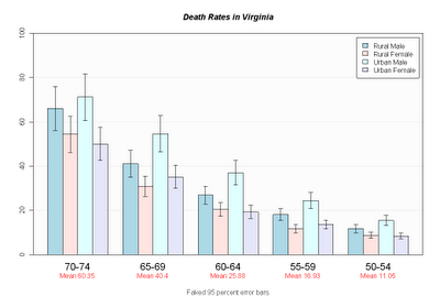
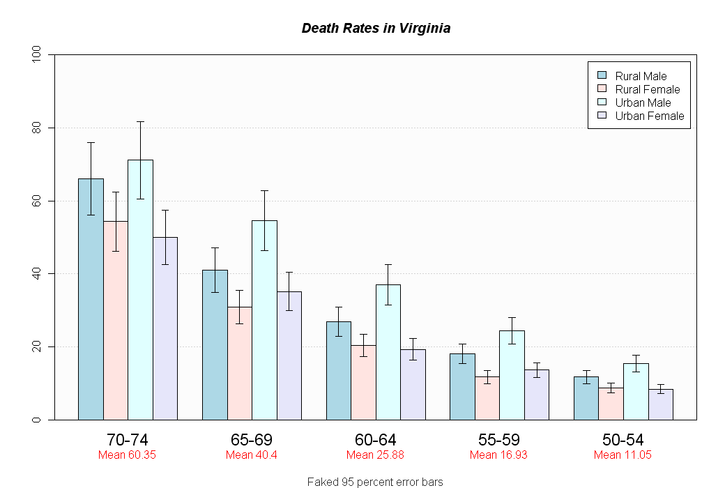
Barplot mit Fehlerbalken


hh <- t(VADeaths)[, 5:1]
ci.l <- hh * 0.85
ci.u <- hh * 1.15


mb <- barplot(hh, beside = TRUE, ylim = c(0, 100)
  , col = c("lightblue", "mistyrose","lightcyan", "lavender")
  , main = "Death Rates in Virginia", font.main = 4
  , sub = "Faked 95 percent error bars", col.sub = "gray20"
  , cex.names = 1.5
  , legend.text = colnames(VADeaths), args.legend = list( bg="white" )
  , panel.before = {
      rect( xleft=par()$usr[1], ybottom=par()$usr[3], xright=par()$usr[2], ytop=par()$usr[4]
        , col="gray99" )
      grid( nx=NA, ny=NULL ) # horiz grid only
      box()
  }
  , xpd=F )


arrows( x0=mb, y0=ci.l, y1 = ci.u, angle=90, code=3, length=0.05 )


mtext( side = 1, at = colMeans(mb), line = 2,
text = paste("Mean", formatC(colMeans(hh))), col = "red" )

Freitag, 6. August 2010

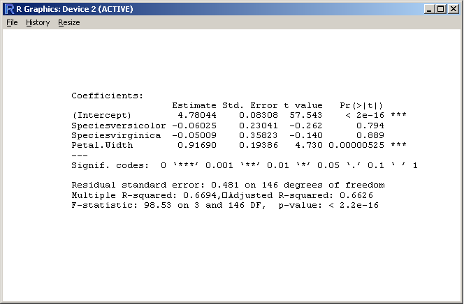
Simple textplot

Putting text on a plot is not that straight on, especially if there's more than one line of text.

data(iris)

# put the summary output into a variable
out <- capture.output
  summary(lm(Sepal.Length ~ Species + Petal.Width, iris)) )

cat( out, sep="\n" )

# create plot
plot.new()

# print text in mono font
text(labels=out, x=0
  , y=rev(1:length(out)) * strheight( "S", cex=0.8 ) * 1.3
  , adj=c(0,0), family="mono", cex=0.8 )


This is what I thought so far. Of course it is straight on to place bulk text on several lines, stupid...
Just collapse the text with newline as separator:

text(labels=paste(out, collapse="\n"), x=0, y=0
      , adj=c(0,0), family="mono", cex=0.8 )

Dienstag, 18. Mai 2010

Format

Tausender-Trennzeichen und Nachkommastellen
format( 1234, big.mark="'", nsmall=2 )
[1] "1'234.00"


leading zeros
sprintf("%04d", 15)
[1] "0015"

oder mit formatC:
formatC(1:5, width=2, flag="0")
[1] "01" "02" "03" "04" "05"


date
format( Sys.time(), "%Y-%m-%d %H:%M:%S" )
[1] "2010-05-19 10:31:57"

numers as hexnumbers
sprintf("%1$d %1$x %1$X", 0:255)

Codes unter R-Help: strptime 

Freitag, 7. Mai 2010

Von R zu Word

Control MS Word from R, do some reporting. The package RDCOMClient is great for that.
The library DescTools (available on CRAN) uses this package and contains some wrapping functions to make things easier.

Dienstag, 15. Dezember 2009

List in DataFrame

d.frm <- data.frame(name=c("Max","Max","Max","Max","Max","Moritz","Moritz","Moritz")
,typ=c("rot","blau","grün","blau","grün","rot","rot","blau")
,anz=c(5,4,5,8,3,2,9,1) )

d.frm <- d.frm[ order(d.frm$name, -d.frm$anz),]
d.frm


Zusammenfassung wie summaryBy:

> as.data.frame( do.call("rbind", tapply( d.frm$anz, d.frm$name, summary )))

       Min. 1st Qu. Median Mean 3rd Qu. Max.
Max       3     4.0      5    5    5.0     8
Moritz    1     1.5      2    4    5.5     9

Dienstag, 17. November 2009

Windows Schriftarten verwenden

Windows Schriftarten müssen definiert werden, bevor sie genutzt werden können:

# Type family examples - creating new mappings
plot(1:10,1:10,type="n")
windowsFonts(
A=windowsFont("Arial Black"),
B=windowsFont("Bookman Old Style"),
C=windowsFont("Comic Sans MS"),
D=windowsFont("Symbol")
)

text(3,3,"Hello World Default")
text(4,4,family="A","Hello World from Arial Black")
text(5,5,family="B","Hello World from Bookman Old Style")
text(6,6,family="C","Hello World from Comic Sans MS")
text(7,7,family="D", "Hello World from Symbol")

Donnerstag, 5. November 2009

Add a time axis


Adding a time scaled x-axis to a plot can be tedious...

# add a time axis
axis(side = 1, at  =as.numeric(seq(as.Date("2000-01-01"), by = "year", length = 10))
  , labels = format( seq(as.Date("2000-01-01"), by = "year", length = 10) , "%Y")
  , cex.axis = 0.8, las = 1)

# plot the timegrid
# vertical gridlines according to chosen time-values
abline(v = seq(as.Date("2000-01-01"), by = "year", length = 10), col = "grey", lty = "dotted")
# where to plot the horizontal gridlines? get the coords by means of axTicks()
abline(h = axTicks(2), col = "grey", lty = "dotted")

Montag, 5. Oktober 2009

Dummy-Kodierung

Gesucht ist die Dummy-Kodierung eines Faktors:

d.frm <- data.frame(
    name=c("Max","Max","Max","Max","Max","Moritz","Moritz","Moritz")
  , typ=c("rot","blau","grün","blau","grün","rot","rot","blau")
  , anz=c(5,4,5,8,3,2,9,1)
)

d.frm
    name  typ anz
1    Max  rot   5
2    Max blau   4
3    Max grün   5
4    Max blau   8
5    Max grün   3
6 Moritz  rot   2
7 Moritz  rot   9
8 Moritz blau   1

Gewünschtes liefert

model.matrix(~d.frm$typ)[,-1]
  d.frm$typgrün d.frm$typrot
1             0            1
2             0            0
3             1            0
4             0            0
5             1            0
6             0            1
7             0            1
8             0            0

oder alternativ die Funktion class.ind aus der library(nnet):

library(nnet)
class.ind( df$typ )

blau grün rot
[1,] 0 0 1
[2,] 1 0 0
[3,] 0 1 0
[4,] 1 0 0
[5,] 0 1 0
[6,] 0 0 1
[7,] 0 0 1
[8,] 1 0 0

Still another brilliant Ripley solution:

ff <- factor(sample(letters[1:5], 25, replace=TRUE))
diag(nlevels(ff))[ff,]

Freitag, 21. August 2009

Read from/Write to clipboard

Daten lesen aus dem, resp. schreiben in das Clipboard ganz einfach:

d.x <- data.frame( x=c(1,2,3,3), y=c("A","B","A","A") )
write.table(d.x, file="clipboard", sep="\t", row.names=FALSE)
a <- read.table("clipboard", header=TRUE)

Montag, 8. Juni 2009

Modell-Formelnotation

---------------------------------------------------------------------------------------------
Operator Bedeutung
----------------------------------------------------------------------------------------------
+... Hinzunahme einer Variablen
-... Herausnahme einer Variablen (-1 für Achsenabschnitt)
:... Wechselwirkung/Interaktion von Variablen
*... Hinzunahme von Variablen und deren Wechselwirkungen
/... hierarchisch untergeordnet ("nested").
.... y/z bedeutet: z hat nur Wirkung innerhalb der Stufen von y, aber nicht global.
^... alle Interaktionen bis zum angegebenen Grad
.... alle Variablen aus dem Datensatz in das Modell aufnehmen
I(). innerhalb von I() behalten arithmetische Operatoren ihre ursprüngliche Bedeutung
.... ("Inhibit interpretation")
----------------------------------------------------------------------------------------------

Bsp:
y ~ x1 * x2 * x3 - x1:x2:x3 # ohne 3-fach Interaktion
y ~ (x1 + x2 + x3)^2 # alle Variablen inkl. Interaktion bis zum 2. Grad

Freitag, 29. Mai 2009

Kombinationen tabellieren

Ausgangslage ist ein data.frame mit einer Zeile pro Element und n Indikatorvariablen. Es stellt sich die Frage nach den Häufigkeiten der Kombinationen der Indikatorvariablen.

d.frm <- data.frame(name=c("Franz", "Maria", "Claudine")
  , A=c(1,0,1), B=c(1,1,1), C=c(0,0,1), D=c(0,1,0))

Solution 1 (clumsy):

# Berechne die Summe der mit einer 2er-Potenz multiplizierten Indikatoren
d.frm$sum <- as.matrix(d.frm[,2:5]) %*% (2^(0:3))

# Erzeuge levels für eine Komb-Faktor
d.lvl <- expand.grid( c(0,"A"),c(0,"B"),c(0,"C"),c(0,"D") )

# Bilde eine neue Variable mit der Textbezeichnung der 2^n-Summe
d.frm$sum_x <- factor(d.frm$sum
  , levels=((d.lvl!=0)*1) %*% (2^(0:3))
  , labels=gsub( "0","", do.call( "paste", c( d.lvl, list(sep="") ))))

d.frm
......name A B C D sum sum_x
1 ...Franz 1 1 0 0 ..3 ...AB
2 ...Maria 0 1 0 1 .10 ...BD
3 Claudine 1 1 1 0 ..7 ..ABC

Solution 2 (smart):

d.frm$sum_xx <- apply( d.frm[,2:5], 1,
  function(x) paste(LETTERS[1:4][as.logical(x)], collapse="") )


Wenn einfach nur die Kombinationen gesucht sind, gibt's dafür die Bordmittel:

> combn( letters[1:4], 2 )
[,1] [,2] [,3] [,4] [,5] [,6]
[1,] "a" "a" "a" "b" "b" "c"
[2,] "b" "c" "d" "c" "d" "d"

Oder auch interessant mit den Funktionen outer und lower.tri (pairwise):

m <- outer(x, x, paste, sep="-" )
m[!lower.tri(m, diag=TRUE) ]

[1] "a-b" "a-c" "b-c" "a-d" "b-d" "c-d"

Get all binary combinations
The idea is to get a vector with n 0s and n 1s, chop it into n parts of c(0,1) (this is a list), and use expand.grid:

n <- 4="4">
expand.grid(split(rep(c(0,1), each=n), 1:n))

Montag, 25. Mai 2009

Gruppenweise Auswertung

Erstaunlich umständlich ist die gruppenweise Selektion von bestimmten Elementen eines dataframes. Zum Beispiel soll gruppenweise das erste Element nach einer vorgegebenen Sortierung zurückgegeben werden:

d.frm <- data.frame(
name=c("Max","Max","Max","Max","Max","Moritz","Moritz","Moritz")
,typ=c("rot","blau","grün","blau","grün","rot","rot","blau")
,anz=c(5,4,5,8,3,2,9,1) )

d.frm <- d.frm[ order(d.frm$name, -d.frm$anz),]
d.frm
....name .typ anz
4 ...Max blau ..8
1 ...Max .rot ..5
3 ...Max grün ..5
2 ...Max blau ..4
5 ...Max grün ..3
7 Moritz .rot ..9
6 Moritz .rot ..2
8 Moritz blau ..1


d.frm[ tapply( rownames(d.frm), d.frm$name, head, n=1), ]
. ..name. typ.anz
4....Max.blau...8
7 Moritz..rot...9


Noch einfacher ist allerdings:
d.frm <- d.frm[ order(d.frm$name, -d.frm$anz),]
d.frm[ !duplicated(d.frm$name),]

Wenn der zweite Wert gesucht wäre, ginge dies mit der Index-Funktion "[":
d.frm[ tapply( rownames(d.frm), d.frm$name, "[", 2),  ]

Montag, 6. April 2009

Umorganisation von Daten

Daten, die pivotisiert vorliegen, können mit reshape (siehe auch stack/unstack) wieder in die Faktor-Form gebracht werden.

# Ausgangslage: Breite Form
> d.wide <- data.frame( age=c(22,34,28,31), gender_c=c("m","w","w","m"), ZH=c(12,33,2,5), BE=c(5,6,3,1))

> d.wide

.age gender_c ZH BE

1 22 ....m 12 .5
2 34 ....w 33 .6
3 28 ....w .2 .3
4 31 ....m .5 .1

# ...und die lange Form:

> d.long <- reshape( d.wide, varying=3:4, times=names(d.tmp)[-c(1:2)], v.names="count", direction="long")

> d.long
age gender_c time count id
1.ZH 22 m ZH 12 1
2.ZH 34 w ZH 33 2
3.ZH 28 w ZH 2 3
4.ZH 31 m ZH 5 4
1.BE 22 m BE 5 1
2.BE 34 w BE 6 2
3.BE 28 w BE 3 3
4.BE 31 m BE 1 4

... und wieder zurück:
wide <- reshape( d.long, idvar=c("age","gender_c","id"), timevar="time", direction="wide" )
wide


Sonntag, 15. Februar 2009

Ränder-Problematik


Einstellungen für Ränder in Grafiken für: mar, mai, mgp, omi, oma.
mar=c(5,4,4,2)+0.1 gleich mar=c(u,li,o,re)+0.1,
mai=c(u,li,o,re) Angabe in inch,
mgp=c(3,1,0) gleich c(Titel, Label, Achse) in mex-Einheiten,
omi=c(0,0,0,0) gleich omi=c(u,li,o,re),
oma=c(0,0,0,0) gleich oma=c(u,li,o,re) in Textzeileneinheiten.

Gauss-Test

Beispiel
Das Gewicht von Briefumschlägen für Luftpost kann als normalverteilt angesehen werden, wobei das mittlere Gewicht weniger als 2 g betragen soll. Die Standardabweichung ist erfahrungsgemäss s=0.02 g. Ein Hersteller entnimmt der Produktion 100 Umschläge und stellt den Mittelwert mw_sp=1.98 g fest.

# Gausstest
n <- 100 # Anzahl Umschläge
MW <- 2 # Mittelwert der Grundgesamtheit
SD <- 0.02 # Standardabweichung der Grundgesamtheit
mw <- 1.98 # Mittelwert der Stichprobe
se <- SD/sqrt(n) # Standardfehler des Mittelwerts
alpha <- 0.05 # Signifikanzniveau

# Quantile der normalverteilung
qnorm(alpha/2, mean=MW, sd=se)
# p-Wert des zweiseitigen Gauss-Testes
2*min(pnorm(mw, mean=MW, sd=se), 1-pnorm(mw, mean=MW, sd=se))

Binomialtest

Beispiel
Jack Player wurde in einem Saloon in Texas erschossen, nachdem er beim Würfelspiel mit seinem Würfel in 60 Würfen 21mal die Sechs gewürfelt hatte und deshalb des Falschspiels bezichtigt wurde. War der Vorwurf seines (jähzornigen) Mitspielers berechtigt?
Man prüfe die Sachlage mit einem Binomialtest!

# Definition der Parameter
p <- 1/6
n <- 60
k <- 21
alpha <- 0.05


# Berechnung BinomialTest
binom.test(k, n, p, "greater")

dens <- dbinom(0:n, n, p)   # Berechnung der binomialen Dichte-Funktion
cols <- c(rep("lightgreen", green <- sum(cumsum(dens) < (1-alpha))), rep("red", n-green+1))


# Zeichnen des Säulen-Diagramms
plot(x=0:n, y=dens, col=cols, main="Tod eines Spielers",
     xlab="k", ylab="B(k,n,p)", las=1,
     cex.axis=0.8, type="h", lwd=3)


# ... und noch eine Textbemerkung
text(20, 0.08, "Binomialverteilung mit p=1/6, n=60", pos=4)


Kombiniertes Säulen-Linien-Diagramm


Ein etwas aufwendigeres Verfahren anhand eines Klimadiagramms:

# get some data
d.temp <- data.frame(
  month=c("Jan","Feb", "Mrz", "Apr", "Mai", "Jun", "Jul", "Aug", "Sep", "Okt", "Nov", "Dez")
  ,nieder_96=c(9, 50, 41, 49, 141, 99, 161, 119, 52, 115, 123, 70)
  ,nieder_mittel=c(67, 65, 67, 85, 103, 135, 136, 130, 101, 81, 74, 76)
  ,temp_96=c(-1.9, -2.1, 3.8, 9.3, 11.8, 17.1, 17.3, 16.8, 10.2, 9.8, 5.4, 0.5)
  ,temp_mittel=c(-1, 0, 4.5, 7.3, 11.9, 15, 16.5, 15.5, 13.9, 8.1, 3.7, 0.2)
)

# define a few colors
hellblau <- rgb(red=204,green=255,blue=255, max=255)
dunkelblau <- rgb(red=51,green=204,blue=204, max=255)
dunkelgrau <- rgb(red=128,green=128,blue=128, max=255)
mittelgrau <- rgb(red=192,green=192,blue=192, max=255)
hellgrau <- rgb(red=227,green=227,blue=227, max=255)

# set the parameters
windows(width=7.2, height=5.5)
par(mar=c(5.1,4.1,7.1,16.1)) # set margins, default: c( 5.1, 4.1, 4.1, 2.1 )
par(bg=mittelgrau) # background color

# start plotting, we use barplot as basis
b <- barplot( t(d.temp[,c("nieder_mittel","nieder_96")])
  , col=c(dunkelgrau, hellblau)
  , beside=TRUE , xlab="Monate", cex.lab=0.8, mgp=c(2.2,0.7,0)
  , space=rep( c(0.3,-0.5), 12) # bars should overlap 50%
  , ylim=c(0,500), yaxt="n"
  , panel.first = {
      par(xpd=FALSE) # barplot paints over the whole figure region by default
      usr <- par("usr") # set background color lightgrey
      rect(xleft=usr[1], ybottom=usr[3], xright=usr[2], ytop=usr[4], col=hellgrau)
     grid(nx=NA, ny=10, col="white", lty="solid") # horiz grid only
     box()
     }
)

# find the centers of the bars and the gaps
barx <- apply(b, 2, FUN=mean)
run.mean <- filter( barx, filter=c(0.5,0.5))[-length(barx)]
gapx <- c(run.mean[1]-diff(barx)[1], run.mean, run.mean+diff(barx) )


# draw the vertikal gridlines
abline(v=gapx, col="white" )
box()

# design x-axis
axis(side=1, at=apply(b,2,FUN=mean), labels=d.temp$month, cex.axis=0.7
  , las=2, tck=-0.025  # no tickmarks for the x-axis
  , mgp=c(2.2,0.7,0) ) # decrease distance label to axis

# left y-axis
axis(side=2, at=seq(0,500,50), las=2, cex.axis=0.7)
rug( seq(0,500,10), side=2, ticksize=-0.01)
rug( seq(0,500,50), side=2, ticksize= 0.01)

# plot lines
par(new=TRUE)
matplot( x=barx, y=d.temp[,c("temp_96","temp_mittel")], col=c(dunkelblau,"grey60")
  , lwd=2, lty="solid", type="l", xaxt="n", yaxt="n", xlab="", ylab=""
  , xlim=par("usr")[1:2] # use the current xlim
  , ylim=c(-25, 25), xaxs="i", yaxs="i")

# design right axis
axis(side=4, labels=seq(-25,25,5), at=seq(-25,25,5), las=2, cex.axis=0.7)
rug( seq(-25,25,1), side=4, ticksize=-0.01)
rug( seq(-25,25,5), side=4, ticksize=0.01)

# write titles
mtext(text=c("Lufttemperatur [°C]","Niederschlag [mm]"), side=3, at=c(25,-3.2), adj=c(1,0)
  , las=1, line=1, cex=0.8 )
mtext(text="Klimadiagramm Zürich-SMA\n556 m. ü. M.", cex=1.2, font=2, side=3, line=3)

# plot legend
legend( x=30, y=27, xpd=TRUE
  , legend=c("Niederschlag 1996", "Niederschlag:\nlangjähriges Mittel", "Temperatur 1996", "Temperatur:\nlangjähriges Mittel" )
  , cex=0.7, bty="n", col=c(hellblau, dunkelgrau, dunkelblau, "black")
  , y.intersp=2.5, pt.cex=1.2, pch=c(15,15,45,45))

mtext("© Statistisches Amt des Kantons Zürich", side=1, line=3.5, at=-4, cex=0.7, las=1, adj=0)
mtext("Quelle: Schweizerische Meteorologische Anstalt (SMA)", side=1, line=3.5, at=41, cex=0.7, las=1, adj=1)

Plot-Zeichen


Was war das schon wieder für ein Zeichen?

parold <- par( mex=0.001, xaxt="n", yaxt="n", ann=F) # save graph sets
plot( x=1:25, y=rep(1,25), pch=1:25, cex=3, xlab="", ylab="", frame.plot=FALSE)
text( x=1:25, y=rep(0.8,25), labels=1:25 )
par(parold) # reset graph sets

Farben


Wie hiess doch schon wieder diese Farbe?

farben <- c( colors(), rep(NA,3) ) # 657 Farben um 3 NULL-Werte erweitern
zeilen <- 44; spalten <- 15 # 660 Farben
farben.zahlen <- matrix( 1:spalten ,nrow=zeilen, ncol=spalten, byrow=T ) # Matrix für Punkte

paralt <- par( mex=0.001, xaxt="n", yaxt="n", ann=F) # Grafikeinstellungen speichern

x_offset <- 0.5
x <- farben.zahlen[,1:spalten] # x-Werte (Zahlen)
y <- -rep(1:zeilen, spalten) # y-Werte (Zahlen)

plot( x, y
, pch=22 # Punkttyp Rechteck
, cex=3 # Vergrösserung Punkte
, bg=farben # Hintergrundfarben
, bty="n" # keine Box
, xlim=c(1,spalten+x_offset) # x-Wertebereich
)
text( x+0.1, y, farben, adj=0, cex=0.8 ) # Text Farben dazu

par(paralt) # Grafikeinstellungen zurücksetzen